 puh.gg
Layouts and card styles
Pick how your page is arranged (Classic, Banner, Minimal and more) and how your card looks.
Open Look in your dashboard. Under Card layout you choose how your page is arranged, and under Card shape the card style.
Arrangements
Look → Layout and colors
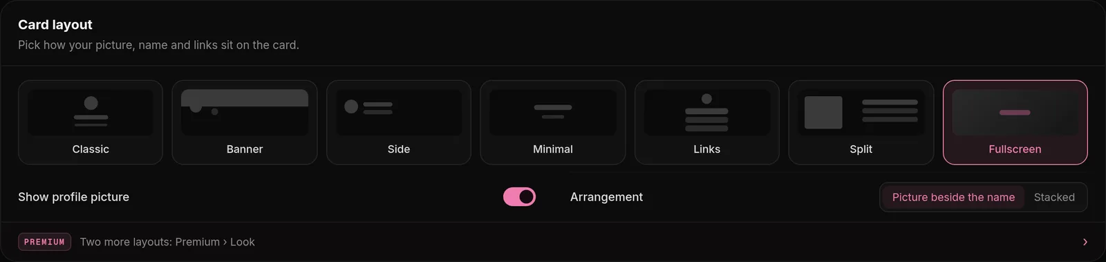
| Arrangement | What it looks like |
|---|---|
| Classic | A centered card with your picture on its top edge. |
| Banner | A banner on top, picture and name side by side. |
| Side by side | Picture and name side by side, without a banner. |
| Minimal | No card. Everything sits right on your background. |
| Links | Big buttons with the name of each link, one below the other. |
| Split | A wide card in two columns: you on the left, your content on the right. |
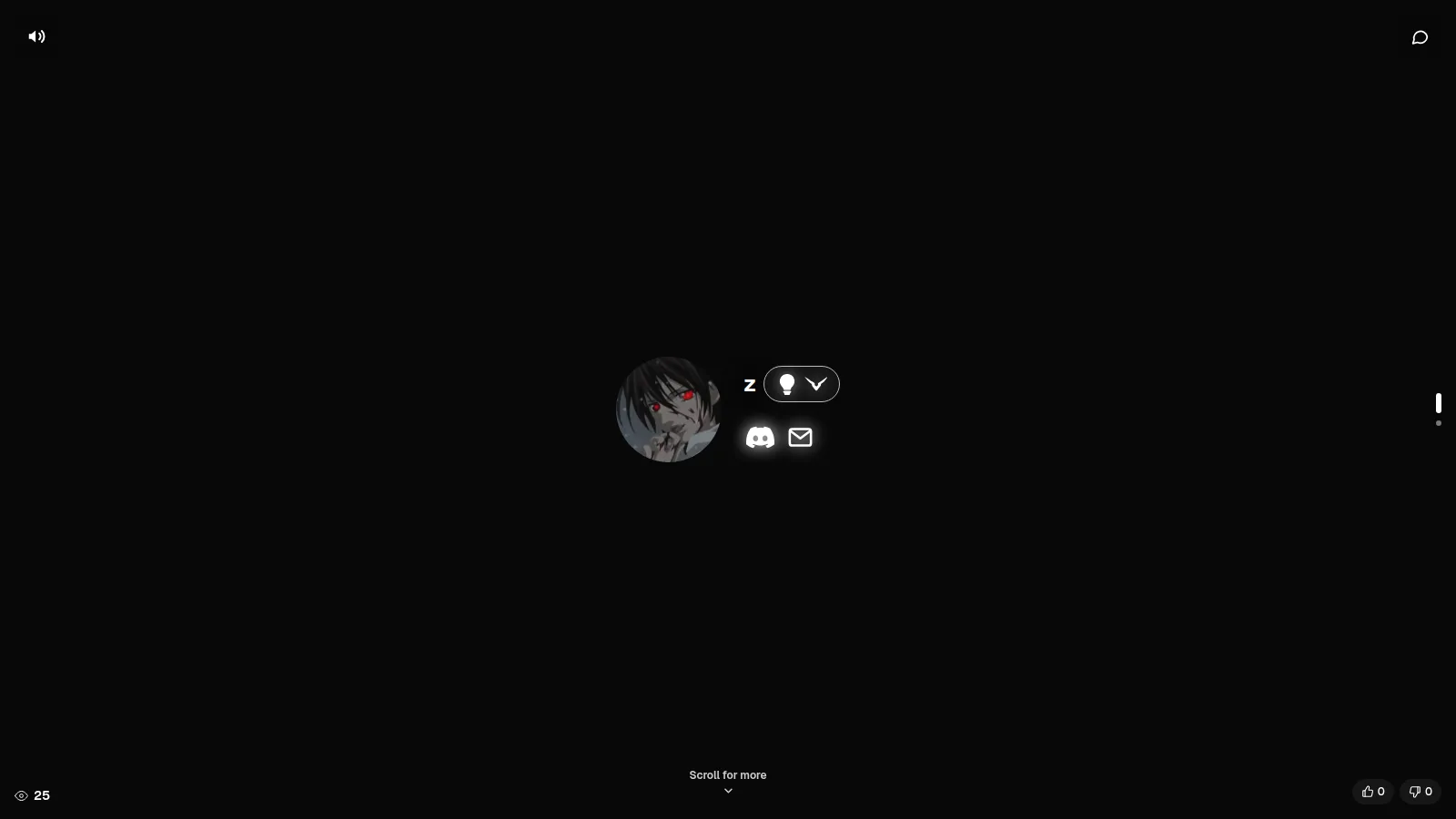
| Fullscreen | No card. Your picture beside your name on the full screen; about me, widgets and music one scroll below. |
| Spotlight (Premium) | A banner hero, a turning color ring around your picture and big link buttons. |
| Showcase (Premium) | Wide, with a banner and its own column for widgets, music and Discord. |
Real pages from our members
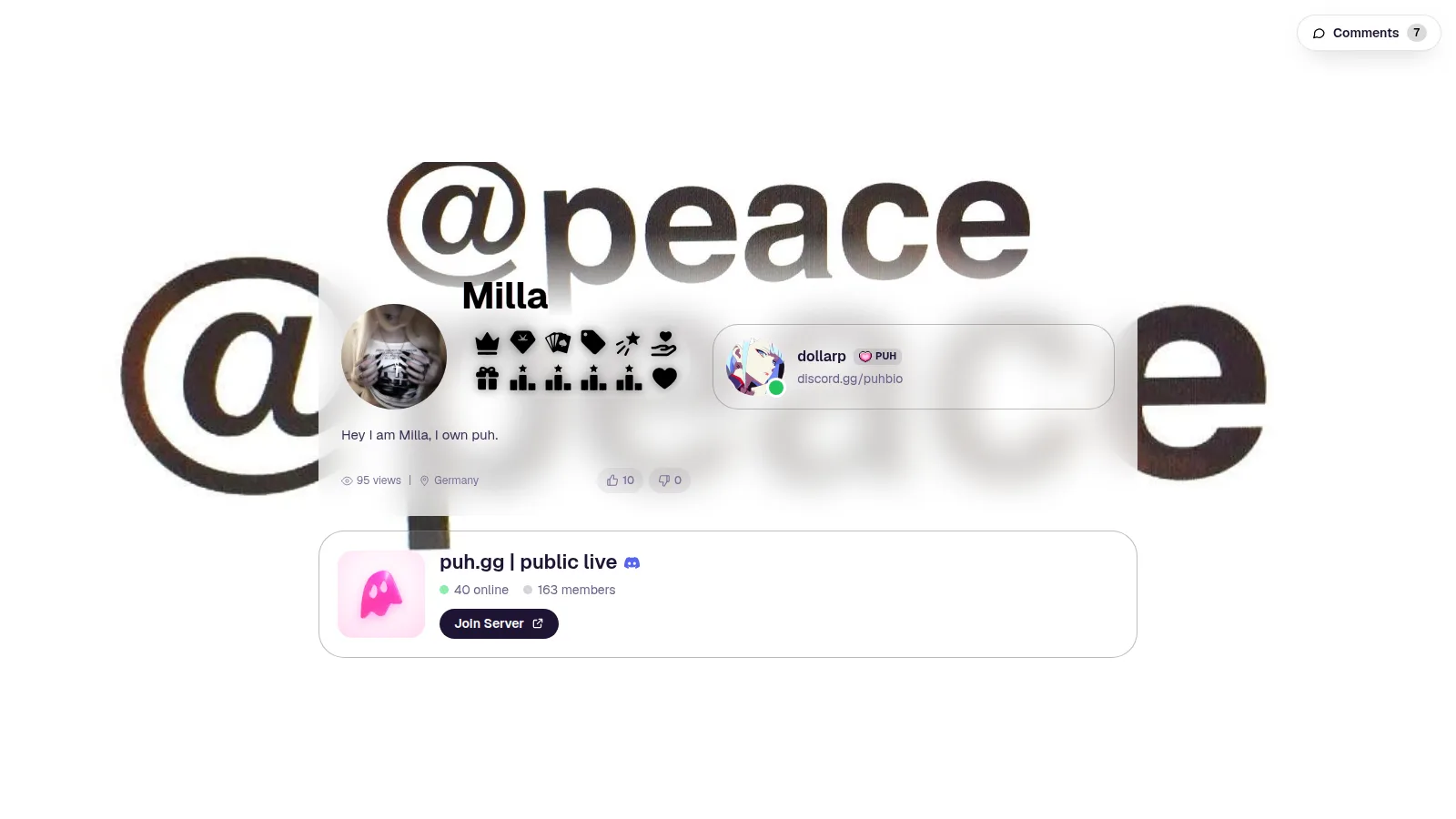
Four pages made on puh.gg, each with a different idea. Open them to see the effects and music live.
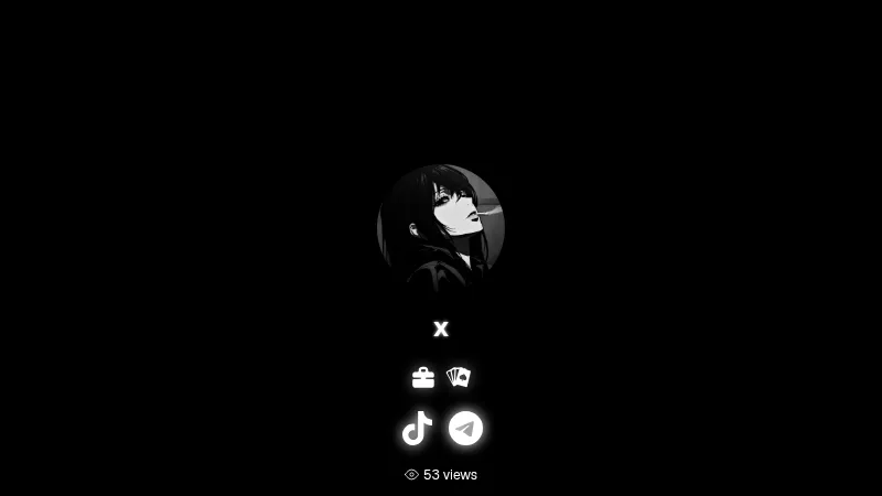
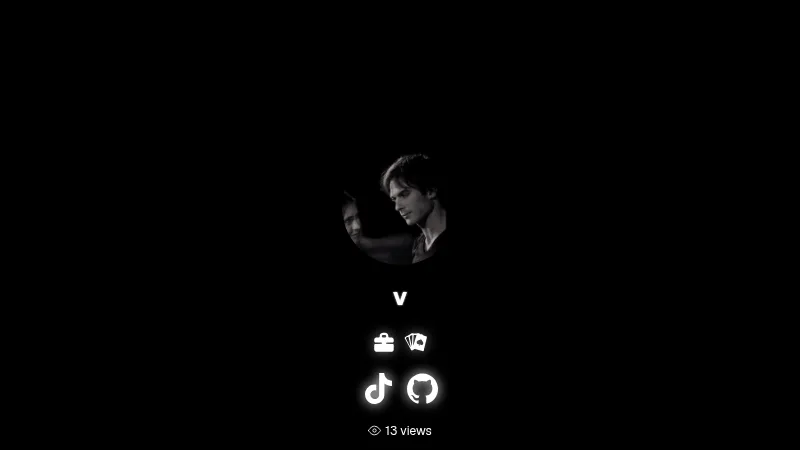
Card style, size and see-through look
Look → Layout and colors
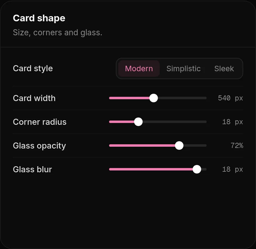
- Card style: Modern, Simplistic or Sleek. Pop is a bold extra style with Premium.
- Glass opacity and Glass blur make the card see-through, so your background shows behind it.
- Card width and Corner radius change the card itself; the size of your picture is in Profile, Profile picture.
- The Shape of your picture (square to circle) is in Profile, Profile picture. Turn off Show profile picture in Card layout for a page with just your name, text and links.
Premium extras for your card
| Option | Where | What it does |
|---|---|---|
| Spotlight and Showcase | Premium, Look, Premium layouts | Two extra arrangements with animated designs. |
| Pop card style | Premium, Look | A bold card style. Turning it off switches back to Modern. |
| 3D tilt | Premium, Look | Your card leans toward the mouse like a real card in your hand, 2 to 20 degrees. Not on phones. |
Which arrangement fits you
- Many links: Links or Classic. Big buttons are easy to tap on a phone.
- A strong background or video: Minimal or Fullscreen, so nothing covers it.
- Lots of content (widgets, music, Discord): Split or Showcase, which give your content its own column.
- A banner picture you love: Banner or Spotlight.
Banner
Banner, Classic and Links can show a banner. Pick one of them in Look, Card layout, upload the banner there, then set Banner height and turn on Fade into the card to blend its bottom edge smoothly into the card.
Watch it change. Every change saves on its own. Press Preview in the top bar to see your page next to the settings while you try layouts.
Was this helpful?Updated Oct 22, 2026